
Table of contents
You already paid for the click. The product is in the cart. The customer is ready to buy.
And then… they disappear during checkout.
For DTC brands, this is one of the most painful – and most fixable – problems. The good news: you don’t need a complete rebuild to get better results. Small changes in how your Shopify checkout is designed and configured can unlock very real revenue.
In this article we’ll walk through what makes a Shopify checkout convert, where Shopify Plus gives you extra leverage with checkout extensions, and how to improve your results step by step.
Why checkout is where profit is won (or lost)
Most brands spend a lot of energy on ads, creative and landing pages. Checkout is treated as a technical detail.
But when a customer reaches checkout, intent is already high. They have decided they want your product. At this stage, you’re no longer convincing them what to buy – you’re convincing them that the purchase will be simple, safe and fair.
That’s why small problems hurt so much here:
unclear totals,
unexpected shipping costs,
missing payment methods,
or a form that feels too long on mobile.
Imagine a skincare brand with a €90 average order value. If their checkout completion rate grows from 62% to 70%, that can mean tens of thousands of euros per year – without increasing ad spend.
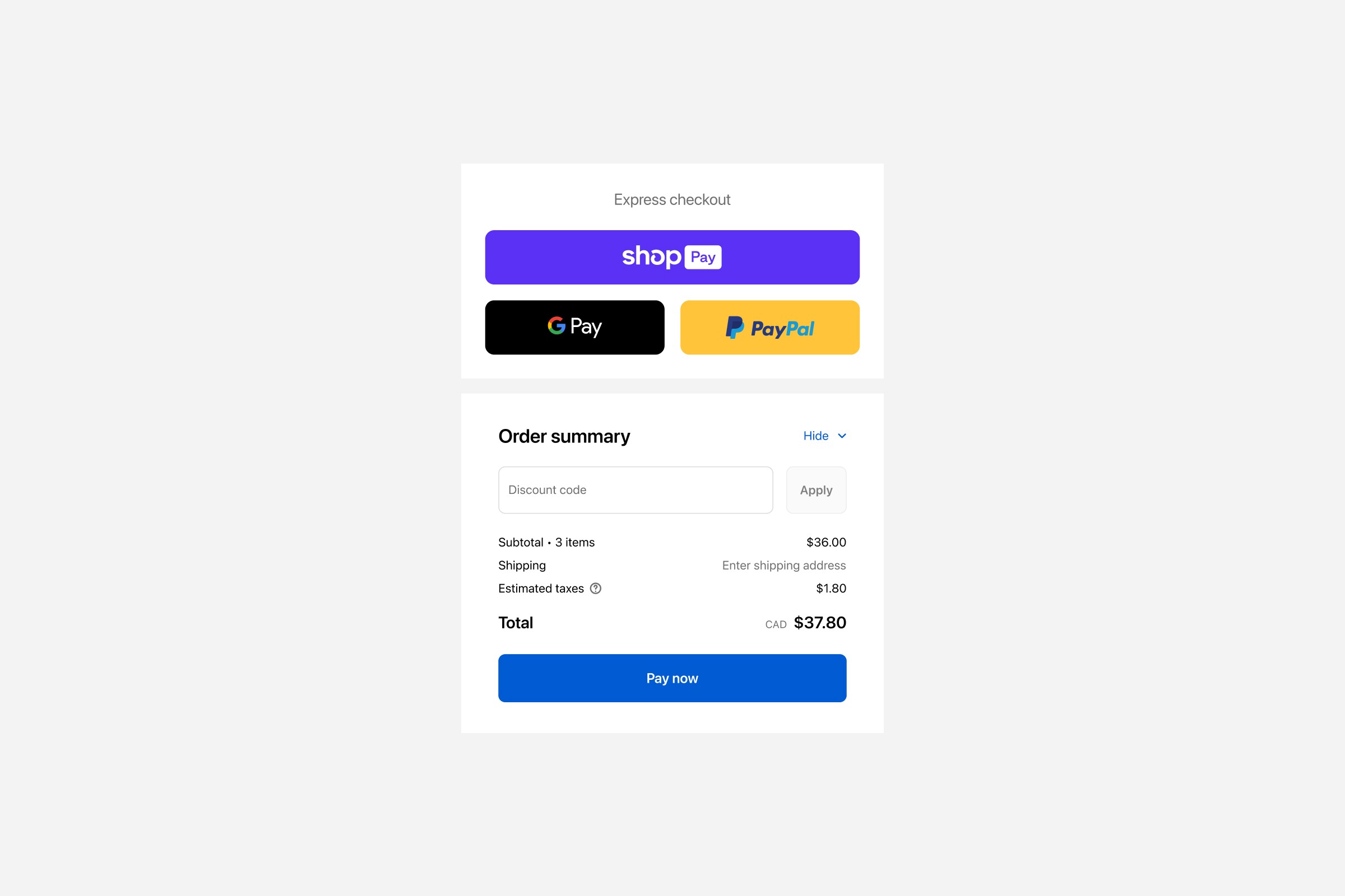
Anatomy of a high-converting Shopify checkout
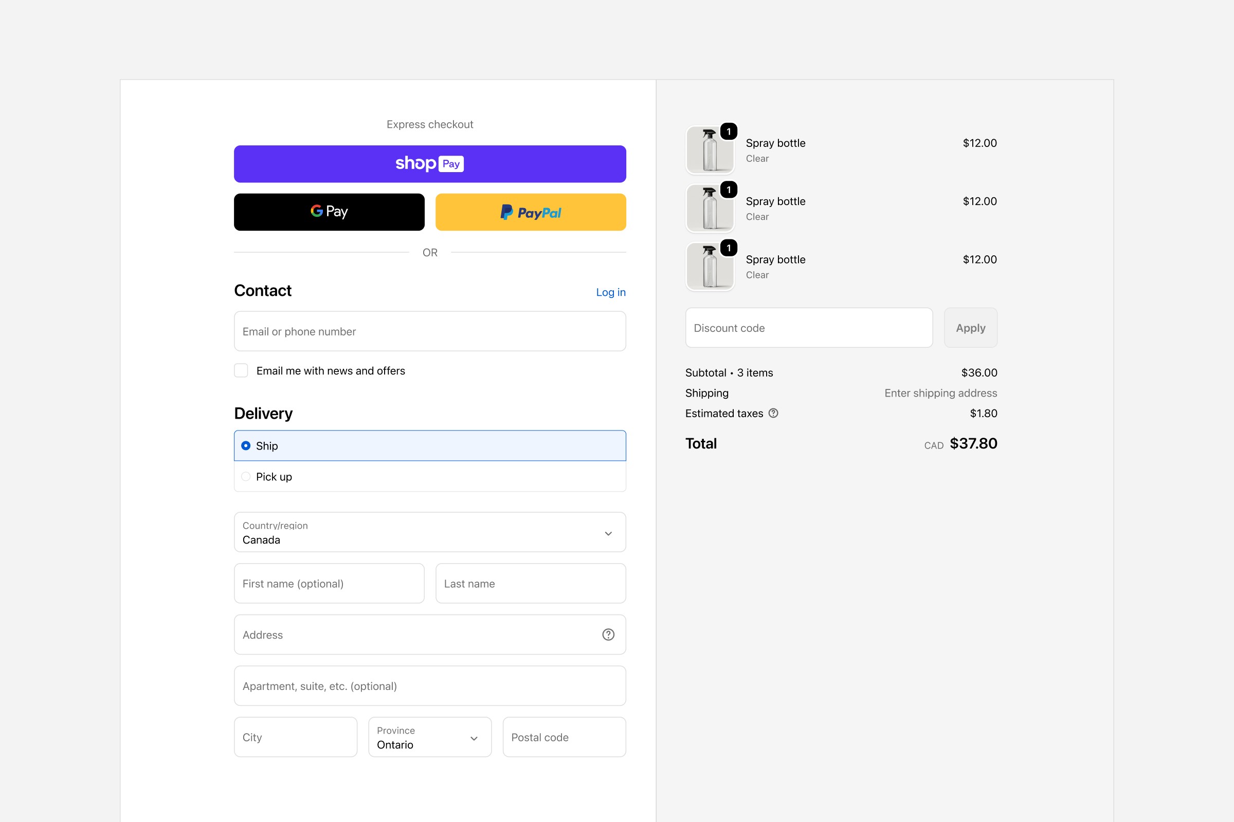
A good checkout is almost boring. There is no drama, no surprises. The customer always knows what happens next.
Let’s break it down into a few simple elements.
1. Clarity and trust
The layout should feel calm. One main action per screen. Clear labels. No “mystery fees”.
At minimum, every Shopify checkout should clearly show:
what is being bought (product names and thumbnails),
the final price, including taxes,
delivery method and estimated timing,
basic trust elements: secure payment, return policy, and contact option.
Example: a jewellery brand we worked with added a short line under the payment section: “Secure payment. Free returns for 30 days.” It looks almost too simple, but together with clearer order summary it reduced checkout-related questions to customer support and improved completion rate.
2. Forms that don’t fight the customer
Long or confusing forms are a classic conversion killer.
On Shopify, start with the basics:
Ask only for what you really need to ship and confirm the order.
Use logical order: contact, shipping address, shipping method, payment.
Make error messages clear and friendly.
Try doing your own checkout on a mobile phone with one hand. If you get annoyed, your customers do too.
Example: a DTC coffee brand removed the “Company name” field and made the “Address line 2” optional and visually less prominent. Nothing else changed – yet mobile checkout felt lighter and drop-off on the first step went down.
3. Price transparency
Customers hate surprises at the very end.
Make sure your order summary is always easy to see and understand:
Show products, discounts, shipping and taxes together.
Explain shipping prices in simple language.
If you have a free shipping threshold, remind customers if they already qualify.
Example: a fashion brand showed a small line in the summary: “You qualify for free shipping (orders over €100).” Before that, customers discovered free shipping only by accident. After the change, the number of support questions around shipping dropped, and conversion slightly increased because fewer people abandoned at the moment they saw shipping cost.
Payment and shipping as conversion tools
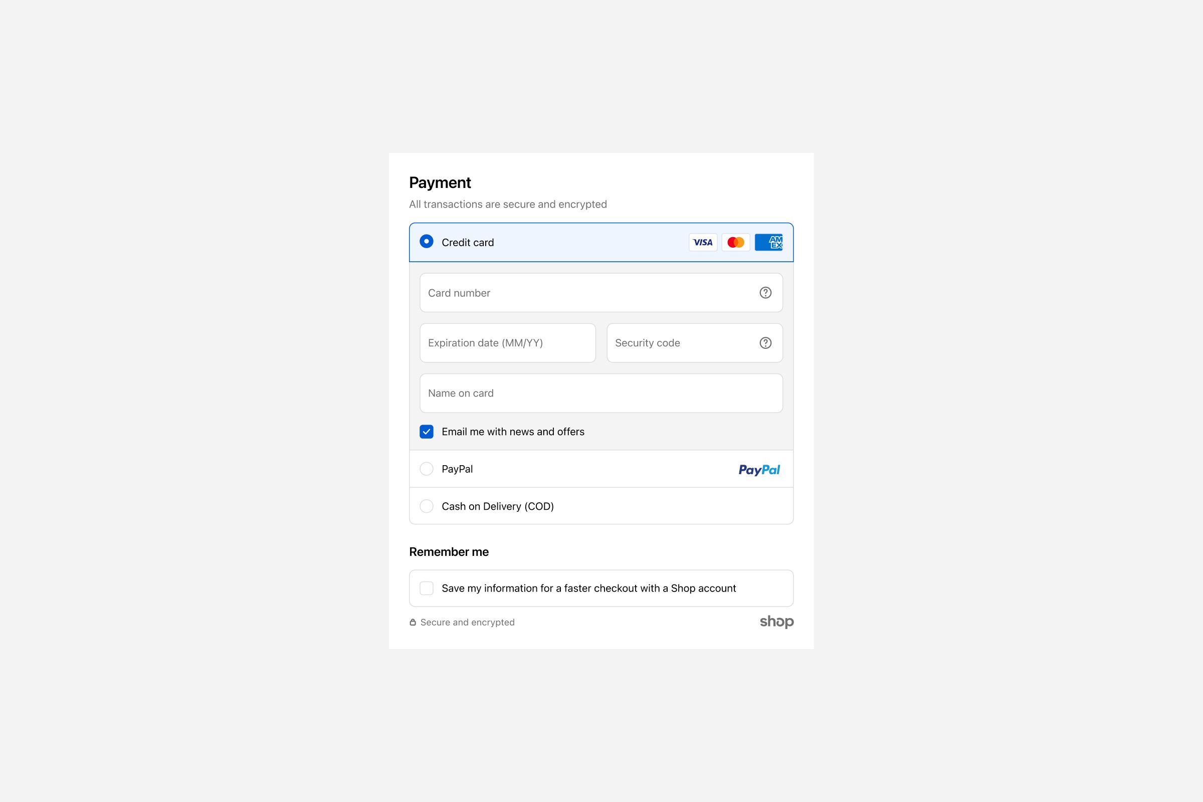
Payment and shipping are not just logistics. They directly affect conversion.
Payment methods that match your market
Customers want payment methods they know and trust. On Shopify, that usually means a mix of:
cards,
local payment methods (for example BLIK in Poland),
digital wallets like Apple Pay or Google Pay,
and, when it makes sense, “buy now, pay later” options.
If you sell to several countries, check which methods are actually used in each market. For a Polish beauty brand, BLIK might be essential. For a German brand, invoices or certain local wallets might matter more.
Shipping options without overload
Offer enough choice – but not too much.
Most brands perform well with two or three clear options:
the most popular and balanced option (for example “Courier – 2–3 days”),
a pickup point option if your customers like it,
sometimes a faster “express” option.
Avoid long lists with ten similar methods. People don’t enjoy reading a shipping catalogue during checkout.
Be precise about delivery times and cut-off times. “Order before 2PM for same-day dispatch” is more concrete than “Fast shipping”.
Mobile-first: where most checkouts happen
For many DTC brands, more than 70% of sessions are on mobile. Checkout has to work perfectly on small screens.
A mobile-friendly Shopify checkout should:
use big, easy-to-tap buttons,
show only the most important information on screen,
handle the keyboard properly, so fields are not hidden,
keep the main “Continue” / “Pay now” button visible whenever possible.
Example: a home décor brand tested a small change: on mobile, they made the primary button full-width and slightly higher, so it was easier to tap with the thumb. It looked almost the same, but click-through to the next step increased.
Where Shopify Plus makes checkout more powerful
Standard Shopify plans give you a strong, secure checkout, but customization is limited. You can change colors, logo and basic settings, but you cannot freely redesign the checkout.
If you need more control, Shopify Plus unlocks Shopify Checkout Extensibility – a set of tools and extensions that let you adjust checkout in a deeper, but still safe way.
It is important to stress: checkout UI extensions and advanced checkout customizations are available only on Shopify Plus. On lower plans you cannot install these checkout-specific extensions.
With Shopify Plus checkout extensions you can, for example:
add an extra section with delivery instructions or legal information,
insert a small cross-sell block with a relevant accessory,
show personalised messages based on cart content or customer tags.
Example: a premium supplement brand on Shopify Plus added a small block in checkout: “Subscribe and save 10% on every order (cancel anytime)”. The block appeared only for specific products. This did not change the existing flow, but improved subscription uptake without hurting one-time purchases.
Upsells that help, not annoy
Upsells can be powerful – or destructive.
A helpful upsell at checkout is:
directly related to the main product,
simple to understand,
easy to add with one click.
For example, a brand selling electric toothbrushes offers replacement heads at checkout with a small note: “Add a spare pack now so you don’t have to reorder soon.” This makes sense. It supports the main purchase instead of distracting from it.
In contrast, a checkout overloaded with five different bundles and random accessories creates doubt and slows customers down.
If you use Shopify Plus checkout extensions for upsells, watch your metrics closely. If the primary conversion rate drops, the upsell might be too aggressive or badly placed.
Measuring your Shopify checkout performance
You can’t improve what you don’t measure.
For checkout, focus on a few simple numbers:
how many customers start checkout,
how many finish it,
where they drop off (which step),
which payment and shipping options they choose.
Use Shopify’s analytics together with tools like GA4 and session recordings to see what actually happens on screen. You don’t need a complex setup to see the main patterns.
Example: by watching recordings, a fashion brand noticed that many customers on mobile tried to go back from the payment step because they were not sure about returns. Adding a short “30-day free returns” line near the total reduced this behaviour.
Simple roadmap to a better checkout
You don’t have to change everything at once. Here is a straightforward way to move forward:
Measure again. See what changed and plan the next iteration.
Review your data. Check your checkout completion rate and drop-off per step.
Fix the basics. Make the summary clear, remove unnecessary fields, and add simple trust messages.
Align payment and shipping. Offer the methods your customers actually use in key markets.
Test on mobile. Go through the entire flow yourself on a phone and note every irritation.
If you are on Shopify Plus, use checkout extensions for small, focused improvements – like a legal note, simple upsell or extra info block.
Closing thoughts – and when to ask for help
A Shopify checkout that converts is not about fancy tricks. It’s about removing doubt, reducing effort, and matching your customer’s habits.
For some brands, small design and copy changes will be enough. For others – especially those ready for Shopify Plus – custom checkout extensions can become a strong competitive advantage.
If you feel that your checkout is costing you revenue but don’t know where to start, Hyper Effekt can help you audit your current flow, plan the right level of customization, and implement a Shopify or Shopify Plus checkout that quietly converts – every day.
Written by
Chris Stola
Published in