
Table of contents
Consistency is the new conversion lever
If your brand sells across multiple markets, seasons, and campaigns, inconsistency is expensive: slower launches, design debt, and UX drift. A solid design system turns storefront UI into reusable building blocks—so teams ship faster, stay on‑brand, and lift CR/AOV without reinventing components every sprint. It also bakes in localization (copy length, currencies, delivery promises) and performance/a11y guardrails from day one, cutting rework. In practice, shared tokens + a core component library + lightweight governance (docs + review) can reduce time‑to‑launch for new pages and campaigns by weeks.
The Insight: What a Shopify storefront design system must solve
Design systems for Shopify aren’t abstract style bibles. They’re a working kit that constrains creativity just enough to drive scale. For premium DTC, that means:
Brand consistency across seasons, markets, and creators.
Speed—marketing can assemble pages from blocks rather than brief a dev each time.
Conversion—components are tested once, reused everywhere.
Internationalization—UI adapts to language, currency, delivery promises.
Build for storefront reality: Liquid + sections/blocks, theme app extensions, metafields/metaobjects—not admin/Polaris patterns.
System anatomy: from tokens to patterns (Shopify‑native)
A design system only works when brand rules become reusable code and content. Below is a Shopify‑native stack you can adopt incrementally—start with tokens, add core components, formalize commerce patterns, model content with metaobjects, and connect localization with Markets.
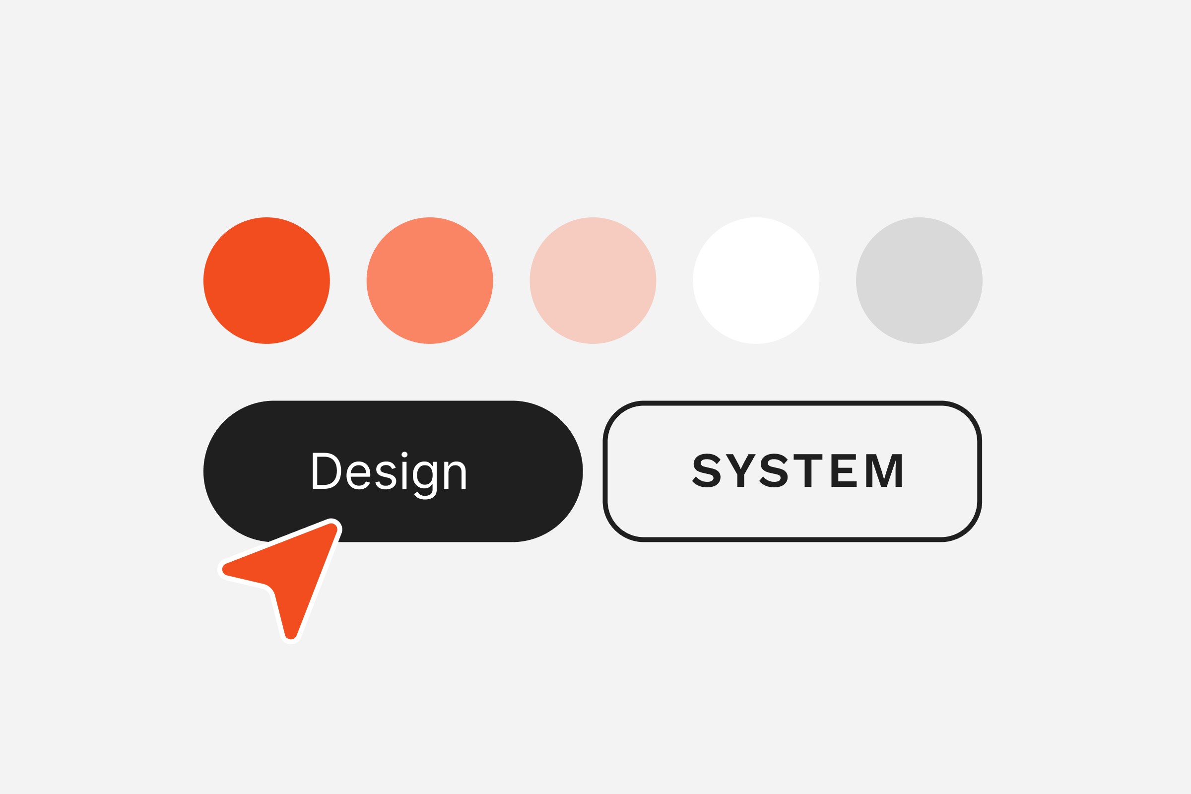
1) Design tokens (the single source of UI truth)
Define color, typography, spacing, radii, shadows, motion, breakpoints as tokens. Expose them as CSS variables in your theme and mirror them in Figma. Support light/dark and brand campaign accents via token aliases.
Quick wins
Map tokens to existing theme settings; avoid one‑off hex values in CSS.
Create a marketing‑safe palette (on‑brand, AA contrast by default).
Set a performance budget for fonts (variable font +
font-display: swap).
2) Core components (Liquid + snippets + minimal JS)
Build a library of storefront components as Liquid snippets/sections with accessible markup and small, composable scripts.
Must‑haves: buttons, inputs, form groups, badges, price, rating, quantity stepper, media gallery, drawer/modal, accordion, toast/inline alerts.
Implementation notes
Keep ARIA roles/labels in the snippet, not per‑page.
Use ARIA‑live for cart/ATC feedback.
Defer non‑critical JS; keep components SSR‑friendly.
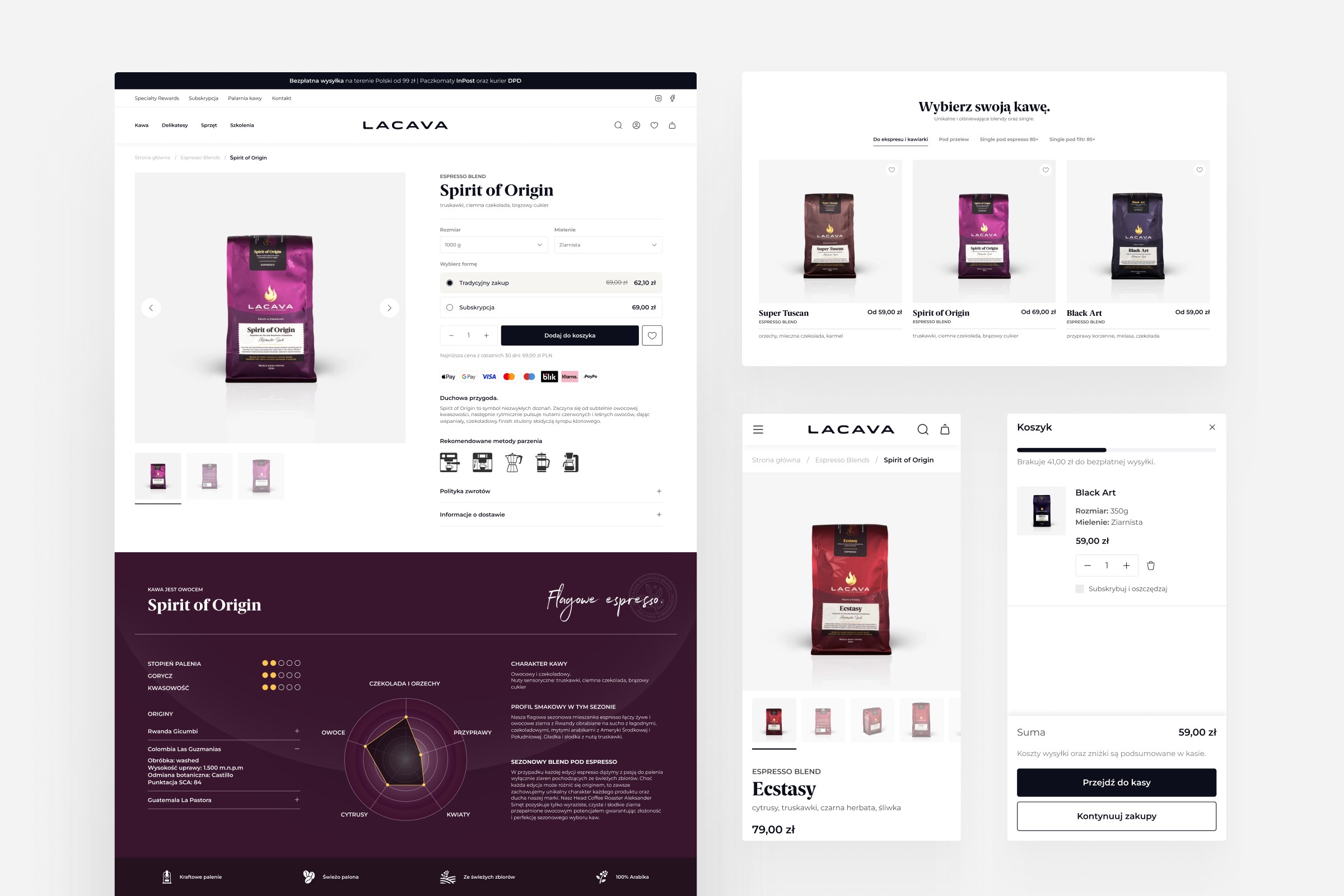
3) Commerce patterns (tested, CRO‑ready)
Package repeatable flows as patterns:
Product card (image ratio, badges, price, swatches, ATC/quick add).
PDP (media gallery, variant picker, sticky add‑to‑cart, trust blocks, delivery/pickup promises by market).
Navigation & search (mega menu, predictive search, zero‑state, merchandising rules).
Cart & mini‑cart (progress bar thresholds per market, cross‑sell slots, shipping estimator).
Checkout micro‑content (returns, payment badges—via Checkout Extensibility on Plus).
4) Content model (metafields & metaobjects)
Abstract copy and merchandising into metaobjects so content scales without code changes: size guides per category, care instructions, materials, lookbooks, store availability, delivery promises.
5) Localization & markets
Bind copy and microcopy to Markets context: currency, duties messaging, delivery dates, local rails (wallets/iDEAL/Bancontact/BLIK/etc.). Keep line lengths and truncation rules language‑aware.
Performance & accessibility baked‑in
Performance and accessibility aren’t afterthoughts—they’re part of the system contract. Bake them into tokens, components, and patterns as acceptance criteria from day one.
A premium system isn’t just pretty—it’s fast and usable for everyone.
Images: responsive
srcset/sizes, AVIF/WebP, lazy‑load below the fold, art‑direction crops for key components.Fonts: max 2 families (prefer 1 variable), subset per language; avoid layout shift.
Scripts: ship only what a component needs; dynamic import for heavy pieces (e.g., video, 3D).
Accessibility: color contrast (AA+), focus states, trap focus in modals, keyboard order, skip links.
Metrics: track LCP/CLS/INP per template; set a budget in your design‑system docs.
Treat perf & a11y as non‑negotiable. Document budgets, enforce checks in CI, and localize choices (fonts, images, copy length) so the storefront stays fast and accessible across markets and devices.
Governance: keep it living, not a PDF
A design system is a product, not a file. Without clear ownership and simple routines it will drift and slow teams down. Put process around it and make rules easy to adopt:
Source of truth: Figma library ↔ storefront components mapped 1:1; token sync (naming parity).
Docs site: usage guidelines, do/don’t, code examples, copy guidelines, localization notes.
Contribution model: small RFCs for new/changed components; design/dev review; a monthly deprecation cycle.
Versioning & changelog: semver for components; communicate breaking changes to marketers.
Testing: visual regression on key templates, a11y checks, performance guardrails in CI.
Treat the system like a product: assign owners, document how to use and change it, version it like code, and enforce tests in CI. That’s how it stays trusted and effective as you scale across markets.
Design once, convert everywhere
A design system lets premium DTC brands move faster without sacrificing brand equity. When tokens, components, and patterns are Shopify‑native—and governed like a product—you ship campaigns in hours, localize with confidence, and keep performance high. That’s how design stops being overhead and becomes a growth system.
Beyond consistency, a living system compounds results: marketers assemble pages from blocks instead of tickets, engineers ship less code with fewer regressions, and experimentation scales because patterns are reusable and measurable across markets. The outcome is a storefront that evolves quickly while staying performant and accessible.
Next steps
Start with an audit → extract tokens from your current theme and map them to CSS variables.
Pilot a core component library (buttons, price, product card, PDP sections) and document usage.
Set up light governance (owners, docs, changelog, CI checks) so the system stays trusted.
Need help? Hyper Effekt builds Shopify‑native design systems for premium DTC brands across EU/UK/US and trains teams to run them.
Written by
Chris Stola
Published in